|
Congrats on completing this fantastic achievement! I know a lot of hard work went into this and it is great seeing in your journal the vast amount of skills you have learnt during this process. |
|
|
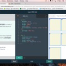
Next up is minmax. And yeah, woke up late this morning because I was up late working.
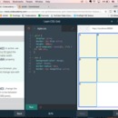
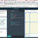
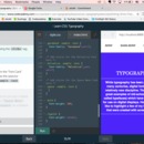
Sometimes you’ll want a grid to resize based on the size of your web browser and you’ll need to prevent a row or column from getting too big or too small. Or when you have a 100px wide image, you don’t want the containing column to become smaller than 100px.
minmax() function will solve this problem.
.grid {
display: grid;
grid-template-columns: 100px minmax(100px, 500px) 100px;
}
3 columns in this example. 2nd will very between 100 and 500 px and 1st and 3rd will always stay the same.
Pretty straight forward.
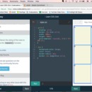
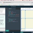
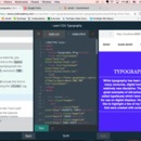
Grid Gap! Putting gaps in between every row and column in the grid.
Properties: grid-row-gap and grid-column-gap
.grid {
display: grid;
width: 320px;
grid-template-columns: repeat(3, 1fr);
grid-column-gap: 10px;
}
grid-gap doesn’t add space at the beginning or the end of the grid. So the above example will have gaps in between (two in total) the 3 columns.
grid-gap sets row and column gaps at the same time:
grid-gap: 20px 10px; <!— this would set the distance between rows to 20px and the distance between columns to 10px —>
grid-gap only takes 2 values: row and column. It doesn’t use a slash / like other properties. And if you only put one value, it will set the gap for both rows and columns to that value.
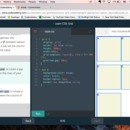
Grid Items: up to this point, all the exercises I’ve done have placed items that take up exactly one square. In the next exercises I’ll be making grid items take up more than one row/column. The next properties I learn will affect the size of grid items and where they are displayed on the grid.
Parent element: grid
Child element: grid item
Manipulating both of these will allow me to create beautiful layouts with ease. CA promises.
Took a little while to read in the beginning -- that acounts for the seemingly short span on time throughout the screenshots. |
|
|
Ok, woke up late, woo. Here we go. Incidentally, I also have to stay awake to monitor a sale until midnight for work. Woo.
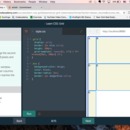
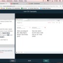
Creating Rows:
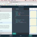
Use the property grid-template-rows to make rows.
Almost identical to the columns version (grid-template-columns).
.grid {
display: grid;
width: 1000px;
height: 500px;
grid-template-columns: 100px 200px;
grid-template-rows: 10% 20% 600px;
}
The example above has 2 columns and 3 rows.
Rows are percentage of the grid’s height.
Columns are percentage of the grid’s width.
Well that’s easy. Similar command.
Grid Template:
You can replace grid-template-rows and grid-template-columns with the following property: grid-template.
.grid {
display: grid;
width: 1000px;
height: 500px;
grid-template: 200px 300px / 20% 10% 70%;
}
Values for grid-template are rows before the slash, columns after the slash.
Size still applies: rows are percentage of height, columns are percentage of width.
Fraction:
Unit in CSS, denoted by fr.
We can define the size of columns and rows as a fraction of the grid’s length and width. fr was created specifically for use in CSS grids.
Prevents overflow of grid boundaries.
.grid {
display: grid;
width: 1000px;
height: 400px;
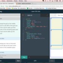
grid-template: 2fr 1fr 1fr / 1fr 3fr 1fr;
}
fr with grid-template seems to add up to the total whole amount (above: 2+1+1=4. Then the noted individual amounts are a fraction of that whole, namely 2/4, 1/4, etc. So the first row is 200px, etc. and the same for columns: 1+3+1=5, then the first column is 1/5 or 200px wide)
Also possible to use fr with other units.
.grid {
display: grid;
width: 100px;
grid-template-columns: 1fr 60px 1fr;
}
60px taken up by the second column, so 40 left to split between the two fr making them 20px each.
Woo cool and simple. It’s just knowing the words and the units that go with them.
Repeat:
These columns and rows properties can take functions as a value:
.grid {
display: grid;
width: 300px;
grid-template-columns: repeat(3, 100px);
}
The repeat function was created specifically for CSS grid. That’s how important it is apparently.
It repeats the specified size for the column or rows for the specified amount of times. In the example above: 3 times, so 3 columns, each that are 100px wide. The same as writing: grid-template-columns: 100px 100px 100px;
Great with fr: repeat(5, 1fr) creates five equal rows/columns.
The size parameter can have multiple values:
grid-template-columns: repeat(2, 20px 50px);
This will create 2 columns for each size specified: 2 columns each 20px wide and 2 more columns each 50px wide.
Well that is super useful. And it saves some time. I’m going to stop here. Have to keep an eye out on work.
|
|
|
|
Happy belated Thanksgiving! I love how you have got back to the swing of things even after the holiday. Some awesome material and skills you are learning. |
|
|
3139428312812231273523127275


